

Project Overview
Kami Gray Interior Design is a full-service interior design and remodeling firm for residential homes and spaces that serves clients in Portland, Oregon and surrounding areas. Kami Gray offers a range of services, from small jobs like helping clients to select furnishings and fixtures, to full remodeling projects including kitchens and bathrooms.
While researching interior design firms, I came across Kami Gray's work on Instagram. Her designs are modern and beautiful, and I wanted to redesign the website to help it better reflect her design work.
Personal Project 2021
tools
Figma, Whimsical, Miro, Optimal Workshop
my role
UX / UI Designer, Branding
project timeline
2 weeks
Problem Statement
Upon visiting Kami Gray's website, I discovered that the display of her design portfolio, navigation through the site, site organization, the logo, and the explanation of her design firm's services could be improved.
Hypothesis
By creating a site that highlights Kami's design portfolio, improves navigation, clearly explains the services offered, and encourages potential clients to book a design consultation, Kami Gray could improve the user experience on her website and increase her clientele.
Research
I began my research with a heuristic evaluation of Kami Gray Interior Design's current website to identify which parts of the site could be improved with a redesign.
CURRENT KAMI GRAY INTERIOR DESIGN SITE


I identified 5 main areas that needed improvement with a redesign:
LANDING PAGE
PORTFOLIO VIEW
SERVICES PAGE
NAVIGATION
LOGO
After the heuristic evaluation of the current site, I conducted competitive market research of a selection of local, national, and international design firms to gain a better understanding of industry standards.
The interior design firm websites that I researched had the following in common: a strong and beautiful hero image, simple and functional site navigation, clear directions for the user to find information about the design firm services, and a call to action for booking a design consultation.


Empathize
After conducting a Heuristic Evaluation of Kami Gray's current site to identify areas for improvement, and Competitive Research of other interior design firms, I began to construct a User Persona and Empathy Map to better understand the needs of a potential client visiting Kami Gray's site.
Anne Donahue, the User Persona, was constructed from a combination of research of Kami Gray's social media following, and my heuristic evaluation and competitive research of similar interior design firms. Anne is a busy stay-at-home mother with 3 children under the age of 8. She has spent significant time looking at pictures of home remodels on social media, and has also watched the results of several friends hiring interior designers to remodel their homes. Anne is ready to remodel her home and has the resources for a project, but doesn't have the time or skills to take on the project herself.


Card Sorting
Now that I had a better understanding of the goals and frustrations of a user like Anne Donahue, I moved on to trying to understand how to create clear, intuitive navigation for the site without making assumptions about how users might categorize information.
I decided to conduct a remote Open Card Sort so that average users could demonstrate how they would label and categorize information in a way that made sense to them. I used Optimal Workshop to conduct the test with 5 participants. The test tasked the participants with organizing 20 different cards into categories and creating their own names for each category.
On average, users created the following categories:
-
Services
-
Projects
-
Press
-
Contact Info
-
Social Media
One of the biggest usability issues with Kami Gray Interior Design's current website is the organization of information and logical navigation. My first and most important consideration for the redesign of the site was to make using the site easier for users by improving the navigation and information architecture.
With the insights I gained from the participants of the Open Card Sort, I created a Site Map that reorganized the content of Kami Gray's website and would promote clear, intuitive navigation to her design Projects, Services, About Page, Press, and Contact Page.
Below are two site maps: The first site map is how I restructured the navigation for the redesign, and the second site map is the current structure of Kami Gray's website.
NEW PROPOSED SITE MAP & CURRENT KAMI GRAY SITE MAP

New redesigned Sitemap for Kami Gray Interior Design

Sitemap of the current Kami Gray site
New redesigned Sitemap for Kami Gray Interior Design
Site Map
User Flow
With the content of the site now organized with the Site Map, I created a User Flow to understand all the steps a user might take when visiting Kami Gray's site, from viewing various projects in her design portfolio, reading about the services offered, reading customer reviews, and booking a design consultation.

Design
Before I began to design, I revisited the primary design goals I developed based on my heuristic evaluation, competitive research, user persona, empathy map, card sorting, sitemap, and user flow.

Design Goals
01
Showcase portfolio of design work in an inviting, easy to navigate, and inspiring way
02
Direct potential customers to view the Services page, and include a CTA to book a design consultation
03
Reorganize the information architecture of the site to make it easy, functional, and accessible
04
Design a new logo and brand that are reminiscent of design firm. Logo speaks to sensibility of Kami Gray design, which are modern, refined, elevated, but accessible
Low-fidelity Sketches
With my design goals in mind, I began with a pencil, pen, and paper and sketched out options for the key screens.
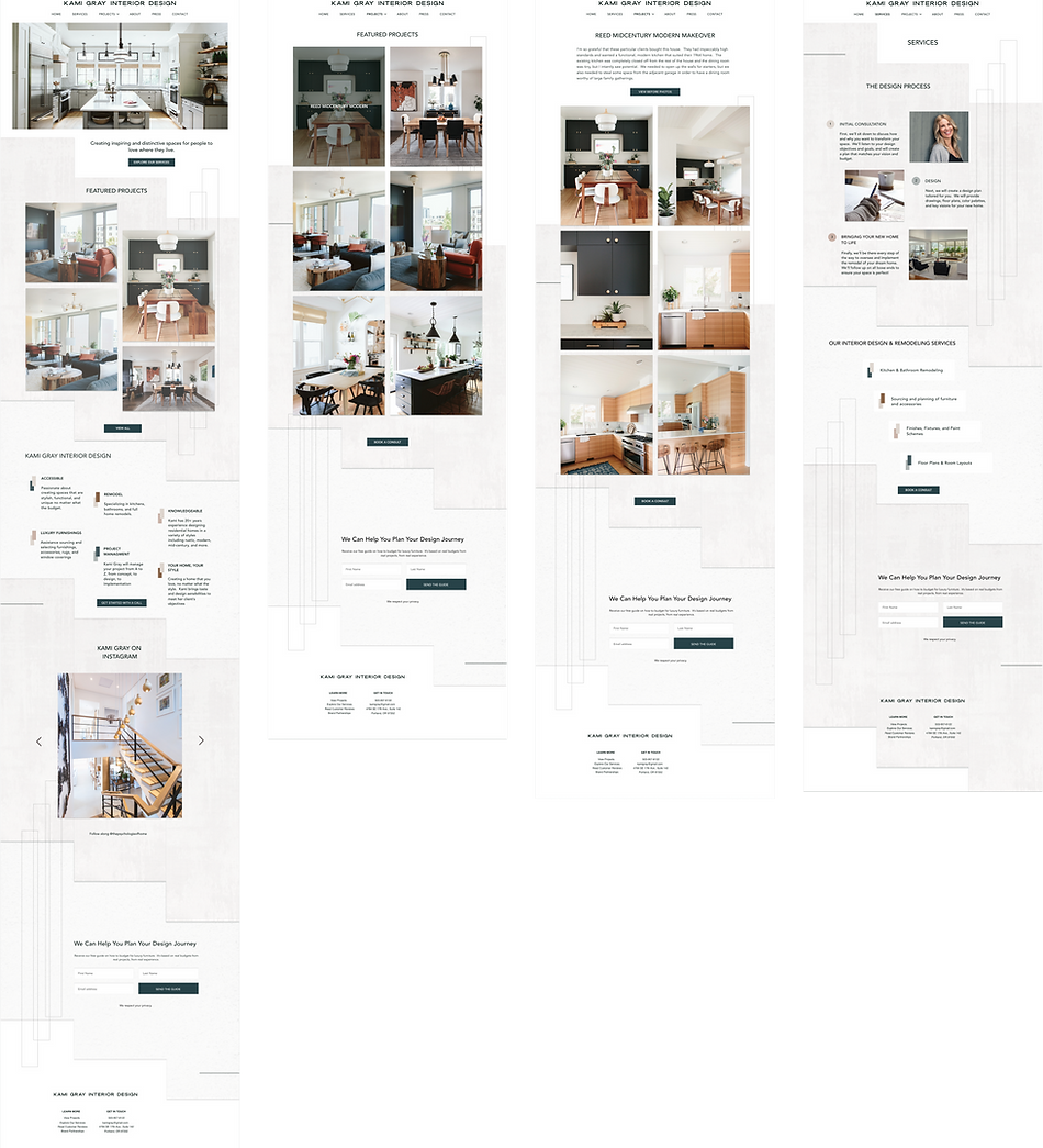
While sketching out each screen, I referred back to the needs and pain points of my User Persona Anna Donahue. When visiting the site, Anne would want to be greeted with an inspiring image of Kami Gray's design work. She would want to be able to easily navigate to a portfolio of design work to see other projects Kami has worked on for inspiration. Anne would also need to quickly find information about the design Services offered, and have an easy way to book a call with the interior designer to discuss her project. For these reasons, I designed the homepage with a large, inspiring hero image, a gallery of recent portfolio work and button to view the Portfolio, and information about Services and a CTA to Book a Consult.
Other important pages included the Projects page, which needed to include a gallery of images of various design projects. I needed to also design an Individual Project page, so that the user could view several images of the project and read about any details.
While designing the Services page, I wanted the user to be able to quickly and easily scan the page to understand the basics of the design process, as well as various design services offered by the firm. Along with the Book a Consult CTA included in the navigation bar, the services page needed to offer another CTA to encourage the user to book a consultation.

Mid-fidelity Wireframes


Learning Moment
My original design for Kami Gray's portfolio Project Page displayed "All Projects" on a single page. After discussions and feedback from designer peers, I realized this original design would be too much for the user to scroll through, and it would be difficult for the user to find exactly what they were looking for.
I iterated on the design and made changes to the Projects Page and Site Navigation. Instead of displaying All Projects together, I created categories of projects, so that the user can quickly sort through projects based on Featured, Budget, Mid-Century, Modern, Traditional, or New Construction and find projects they are interested in more easily.
Project Page Before

Design Change to Navigation

Projects Page After

After designing the layout and flow of the site with mid-fidelity wireframes, I set out to design a new logo and branding for Kami Gray's site that felt modern, refined, elevated, and matched the sensibilities of her design portfolio.
Feeling inspired by the colors and materials of Kami Gray's designs, I used images, shadows, and shapes to create texture and depth for the website that felt reminiscent of architectural elements and interiors.


Logo & Branding
High-fidelity UI Design
SELECTED DESKTOP SCREENS
A user like Anne Donahue is busy with her children and family and spends a lot of her day on the go. She also like to spend time on Instagram keeping up with friends, and enjoys looking at images of home remodeling inspiration on Instagram.
Because Anne is often on-the-go and spends time on her phone, she will most likely spend time looking at Kami Gray's website on her phone or tablet. For this reason, it was very important to make sure the website redesign is highly functional and looks great on a variety of devices. As I worked on the redesign of Kami Gray's website for desktop, I also created Responsive Designs for tablet and mobile.
RESPONSIVE DESIGN


In order to test the usability of the website, I created a high-fidelity Prototype using Figma, and planned to test the prototype with users who would be asked to complete the following tasks:
-
Task 1
-
Navigate to the "Featured Projects" Page
-
-
Task 2
-
Navigate to the "About" Page
-
-
Task 3
-
Navigate to the "Services" Page
-
-
Task 4
-
Book a design consult for Thursday, September 9 at 1:00 pm
-
Using the high-fidelity Figma prototype, I conducting remote usability testing via Zoom with 4 participants.
The results of my usability testing indicated that users needed the "Book a Consult" option to be easier to find.
USABILITY TEST AFFINITY MAP

Usability Test Results
Design Iterations
NAVIGATION BAR BEFORE ITERATION

NAVIGATION BAR AFTER ITERATION

In order to address the pain points that users experienced during usability testing, I set about making design iterations based on user feedback. Since users struggled with the task of booking a consult, I realized that "Book a Consult" needed to be easier for users to find.
I decided to add "Book a Consult" to the main navigation as a CTA button. Now, the option to book a consult would be easy to find and readily visible from anywhere on the site.
Next Steps
To go further with this project, I would plan to conduct more usability testing with additional pages of the site, as well as follow up with web analytics to understand if and how the new site is working to encourage users to book a design consultation with Kami, request an interior design guide, and schedule services with her firm.