

Project Overview
Mirror is a successful clothing company with an international presence in 32 countries and over 400 store locations.
Mirror offers clothing for women, men, and children in a large variety of styles including work attire, casual, athletic, and formal. They offer good quality clothing at affordable prices.
Personal Project 2021
tools
Figma, Optimal Workshop, Miro, Whimsical
my role
UX/UI Designer
timeline
5 Weeks


Project Goal
Mirror needs to create an online presence that will match the success of their brick and mortar stores. They want to create a responsive e-commerce site that will allow customers to easily find the clothing they want in the site's large inventory.
Mirror is also looking to rebrand with a site and logo that feels modern and neutral.
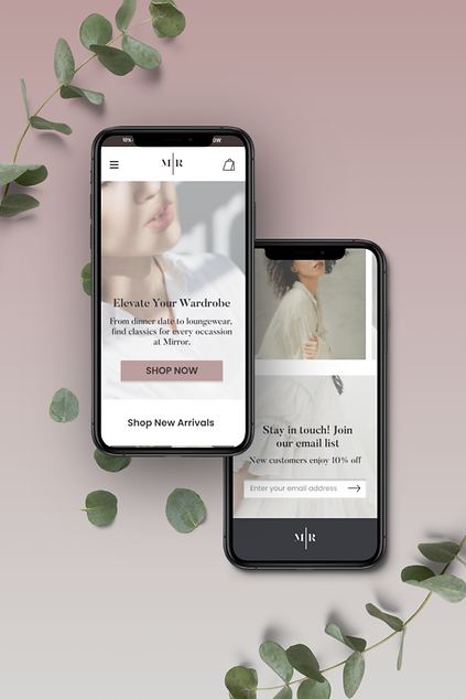
The project goal is to create a responsive e-commerce site that is both easy to use and a pleasurable shopping experience for the user.
Research

Research Goals & Objectives
01
Understand what promotes a positive online shopping experience for the user
02
Learn which features are necessary to create an easy to navigate retail site
03
Research brands and logos that appeal to a broad, international audience
04
Gain insight into when and why users experience frustration with online shopping
Research Methods & Findings
In order to design a responsive e-commerce fashion website that provided a simple, intuitive, and pleasurable shopping experience for Mirror's users, I first had to gain an understanding of how other popular fashion brands structure their site, and what makes the shopping experience successful for their users.
I proceeded to conduct a competitive analysis of comparable and successful online clothing stores such as Zara, H&M, and Nordstrom, to gain a better understanding of industry practices as well as how other online clothing stores create a pleasurable shopping experience.


Key findings from my research revealed that easy to use filters to navigate through large inventories and clear navigation were very important. Seamless responsive design to allow users to make mobile purchases was also a priority.
To gain a better understanding of users' experiences with online shopping, I conducted 1:1 Interviews to speak directly with users. I sought to learn about any frustrations users experience while shopping online, what specific things contribute to a positive online shopping experience, and what types of stores users gravitate towards and why.
I conducted the 1:1 Interviews remotely on Zoom with four participants between the ages of 31 and 65. I gained the following insights from the user interviews:
Users' primary goals included:
-
Finding reliable sizing
-
Pleasurable shopping experience
-
Great quality, ethical, low cost clothing
-
Easy, intuitive navigation
-
Simple and fast returns
-
Excellent customer support
Users' experienced frustrations with:
-
Inconsistent sizing
-
Waiting for shipping and returns
-
Items out of stock


Empathize
My market research and user interviews helped me discover that users are searching for excellent customer service, ease of returns, reliable sizing across brands, and good quality clothing at fair prices.
I created the User Persona Susan Daley based on my research findings, to reflect the needs and pain points experienced by my interview participants.
Susan is a busy, professional woman in her 30's with a family. She doesn't have a lot of time for shopping, but wants to look good and feel good about herself at work and at home. Because she doesn't have a lot of time to shop, she needs to be able to find what she needs quickly and meet all of her shopping needs in one place. Susan feels frustrated by inconsistent sizing across brands, and often wishes she could feel the materials of clothing she is purchasing online.


Card Sort
Now that I had a better understanding of the goals and frustrations of a user like Susan Daley, I moved on to trying to understand how to create clear, intuitive navigation for the site without making assumptions about how users might categorize information.
I decided to conduct a remote Open Card Sort so that users could demonstrate how they would label and categorize information in a way that made sense to them. I used Optimal Workshop to conduct the test with 6 participants, ranging in age from 31-40. The test tasked the participants with organizing 20 different cards with clothing item names such as "romper" and "black dress" into categories, and then giving each category a name.
On average, users creating the following categories:
-
Shoes
-
Accessories
-
Outerwear/Jackets
-
Tops / Shirts
-
Bottoms / Pants
-
Sweaters / Sweatshirts
The Card Sort research gave me valuable insights into how users name and categorize clothing items. The Card Sort, along with the competitive analysis and 1:1 Interviews, helped me build a Site Map that organized Mirror's content in a simple and intuitive way for the user.
With the user's pain points and goals clarified through the User Persona, and the information architecture structured through the card sort, I set about creating a Site Map that laid out the main pages and functionality of the site.
Making sure that the site is highly organized and that the navigation is logical and easy-to-use was a highly important design consideration for the following reasons:
-
A user like Susan Daley doesn't have a lot of time to shop. When she is shopping it's imperative that she can find what she is looking for quickly
-
Mirror has a large inventory, including Women's, Men's, and Children's clothing, so an intuitive navigation menu as well as easy-to-use filters are essential for users to find the clothing item they need

With the content of the site now organized with the Site Map, I moved on to constructing a User Flow in order to map out all the steps a user like Susan Daley might take when visiting the Mirror site.

Design
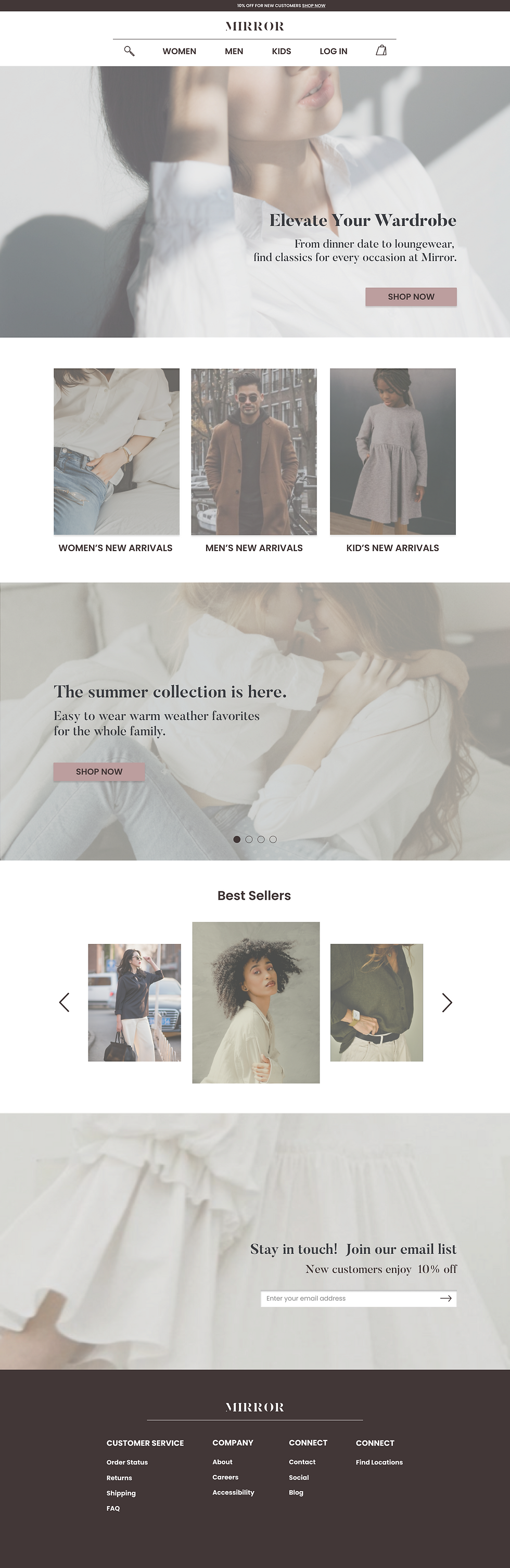
Keeping the needs and pain points of Susan Daley in mind, I began to build the mid-fidelity wireframes of screens such as the homepage, navigation menu, product page, shopping bag, and checkout page.
When designing the homepage, I sought to:
-
Greet the user with an inspiring hero image and CTA to shop one of Mirror's collections
-
Provide the user with easy-to-navigate options for shopping either Women's, Men's, or Children's clothing
-
Provide the user with a option to shop Best Sellers to quickly and easily shop for items that have been highly reviewed by other customers
-
Design a navigation menu that is detailed enough for the user to quickly find whatever item they are looking for
SELECTED MID-FIDELITY WIREFRAMES


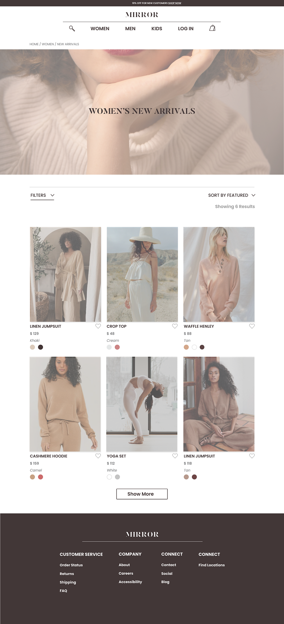
In order to best serve the needs of Susan Daley, the key design considerations for the Product Page included the following:
-
Multiple images and views of the product to give the user the best idea of how the material looks and feels
-
A size guide to understand how the clothing item will fit the user
-
A "Styles You Might Like" section to give the user curated ideas for other items that would work well based on their preferences
-
A "Ratings & Reviews" section so that the user can view how clothing items fit other customers, with the option to filter by customers that have a similar body shape
After completing the mid-fidelity wireframes, I moved on to developing Mirror's new brand identity and made decisions about the UI for the site.
I began with a mood board of images, fonts, and colors to establish the tone for Mirror. Words I focused on, according to the project goal and my user persona were: bright and light, modern, minimal, neutral, classic and familiar, pleasant, and elevated.
BRAND MOOD BOARD

LOGO DESIGN

UI KIT


With the Branding and UI Kit complete, I applied the High-Fidelity UI to all of the mid-fidelity wireframes.
SELECTED HIGH-FIDELITY WIREFRAMES
I created a Prototype to test the usability of the following tasks with users:
-
From the Homepage, navigate to Women's New Arrivals
-
From Women's New Arrivals, select the Waffle Henley and add a size
-
Search for a white dress
-
Use filters to narrow search by Size small and color white
-
Add the Lace Dress in a Size Small to the Shopping Bag

Usability Test Results
I conducted remote usability testing via Zoom with 5 participants.
My test findings indicated that some users experienced confusion when using the filters, and struggled to differentiate between the "Filters" and "Sort By" features. After receiving peer feedback, I sought to iterate on the design of the "Filters" and "Sort By" to make the features more intuitive for users.
USABILITY TEST AFFINITY MAP

Design Iterations
Design Iterations
Because of Mirror's large inventory, designing Filters that are simple, intuitive, and functional so that the user can easily sort through results to find the right items is a high priority.
In order to address the pain points users experienced with the Filters during usability testing, I sought to make the following design iterations to improve the usability of the Filters:
-
Create a clear distinction between the "Filter" and "Sort By" function
-
Create an easy-to-use Filter module where users could select all of the filters they wanted to use at once
-
Improve the text label on the "Sort By" feature to include how the products are currently being sorted and increase user understanding
FILTERS BEFORE

FILTERS AFTER

SORT BY AFTER

next steps
Due to the timeline of this project, not all of the site functions and pages have been designed yet.
With more time, my next design priority will be to design a sizing guide that allows users to confidently compare sizing among brands, so that they know how Mirror's sizing will compare with what they already own. The goal of this design will be to help guarantee a good fit, minimal need to return purchases, and increase customer satisfaction.